BRAND
The Lunava signature identity
One mark, one palette, one voice, applied consistently across every page, document and proposal we issue.
THE MARK
A crescent 'L' with a momentum arc
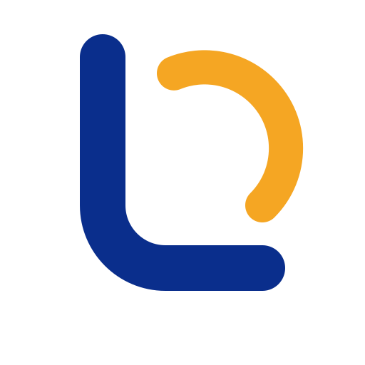
The monogram draws the L of Lunava as a crescent stem, a nod to luna, while the orange arc traces the forward motion our clients are buying. It is legible at 16px and holds its weight on a building sign.
Monogram, primary
Full lockup, light backgrounds
Full lockup, reversed
COLOUR
Palette
Blue carries authority, ink navy carries depth, and orange is used sparingly as a signal, never as decoration.
Corporate Blue
#0A2E8CPrimary, logo, headings, primary actions
Deep Blue
#082468Depth, gradients, hover states
Signal Orange
#F5A623Accent only, never for large areas
Ink Navy
#0B1B3ADark panels, footer, hero backgrounds
Mist
#F1F4FASection backgrounds and subtle separation
Paper
#FFFFFFBase background and cards
TYPOGRAPHY
Sora for structure, Manrope for clarity
Two typefaces only. Sora sets headlines and the wordmark; Manrope carries every line of body copy, table and label.
SORA, HEADINGS
Delivery you can audit
Semibold, tight tracking, sentence case. Used for H1–H3 and the LUNAVA wordmark at 0.16em tracking.
MANROPE, BODY
We build portals, engineer software and run sourcing programmes for governments, enterprises and development institutions operating in and through the UAE.
Regular and medium weights, 1.7 line height for paragraphs, 0.2em tracking for eyebrow labels.
USAGE
Applying the identity
Every page on this site follows these rules, the same rules apply to proposals, tenders, decks and signage.
Do
- Keep clear space around the logo equal to the height of the monogram.
- Use the reversed lockup on ink navy or photography; use the primary lockup on white.
- Use the monogram alone for favicons, avatars and stamps below 32px.
- Set headings in Sora Semibold and body copy in Manrope Regular.
- Reserve signal orange for eyebrows, arcs and small emphasis details.
Don't
- Do not recolour the monogram or replace the orange momentum arc.
- Do not stretch, rotate, outline or add effects to the mark.
- Do not place the primary lockup on busy imagery without an ink overlay.
- Do not use orange for body text, large fills or button backgrounds.
- Do not substitute system fonts for Sora or Manrope in brand materials.
DOWNLOADS
Brand kit
Everything you need to represent Lunava correctly in tenders, partner decks, press and event material. Vector first, with raster fallbacks and the exact colour and typography tokens we use.
SVG and PNG lockups, monograms, app icons, colour tokens and typography styles.
Logo lockups
Full monogram-and-wordmark lockup for light, dark and ink-panel placements.


Monogram & icons
The crescent-L mark on its own, plus square icon sizes for apps, avatars and favicons.


Colour & typography
The exact tokens behind this site, drop them straight into code or a design file.
Need our brand assets for a tender or partnership?
Download the kit above, or contact us for print-ready artwork, signage specifications and co-branding approval.